Do not post bugs or requests to the comments! Use Trac.
Thursday, September 14, 2006
Icons of the past and the future
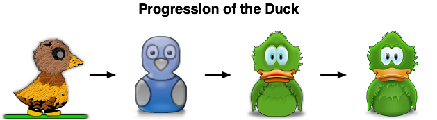
When Skyler Cohen showed this image to everyone, I thought it was really awesome. It shows where we've been and where we're going.
The messenger bird icon we've had has always been a point of contention for some folks. The "zombie duck" as I like to call the first one got replaced by the "classic style" duck. Then we have old Adium and new Adiumy (the two images on the right).
Overall though, the duck has been a good mascot and has worked well for us for years. It's drawn sharp criticism by some, and love and affection by others. You have to know you are doing something right if you get that kind of reaction.
In either case, just thought I'd show this to everyone.
# posted by Chris Forsythe at 5:15 AM
Comments:
Woah! first time I see the first duck... that's... well, let's just say the current one is much better!!! ;-)
I, too, had never seen the zombie duck before. I've liked every default duck i've had, and the variety of ducks has been great. as someone who was upset when steve jobs decommissioned the icon garden (where is clarus?!!), i'm a big fan of off-the-beaten-path icons, and the Adium duck (and the sounds that can accompany it) are off the beaten path and on the unbeatable path of awesome!
It's interesting to note how great the Adium icon is when MacWorld points out that *most* application icons take the form of a circle or globe.
Go Ducky!
Go Ducky!
Anyone else looking for the second (blue) duck dock icon can find it http://www.adiumxtras.com/index.php?a=xtras&xtra_id=234
Took me a while to find it without knowing its name, hope that helps someone else.
I guess my main opposition to the duck icons are:
1. It reflects poorly on the application as something polished. I know plenty of people who have downloaded adium, seen the icon and trashed the program immediately figuring that no polished app would have such a silly icon.
2. It is not obvious (http://www.jasperhauser.nl/weblog/2006/07/obviousness.html). What does a duck have to do with messaging?
3. It is kind of ugly....
i think the zombie duck kicks the ass of all other icons in the dock....anywhere it can still be found?
the last duck in that evolution-picture isn't the duck that's on the adium front page. i'm not on my mac right now but i'm pretty sure it's not the application icon either. the third one is the current one, as far as i know.
even though i like the last one.
i'll go to EXTRAS right now to search down the 4th one in the picture.
even though i like the last one.
i'll go to EXTRAS right now to search down the 4th one in the picture.
to I am Dali> I think the last one is thew one used in the betas of Adium 1.0.
Personnaly even though I like the last version of the beak, I like green duck one better the lattest. I'm no big fan of those gradients...
Anyway, long life Adiumy & Adium itself!
Personnaly even though I like the last version of the beak, I like green duck one better the lattest. I'm no big fan of those gradients...
Anyway, long life Adiumy & Adium itself!
The "duck" theme is VERY attention-gathering. When my computer starts quacking away, you better believe people get curious and ask me what IM app I'm using. I've managed to convert every Mac user I know. Besides, if you don't have a sense of humor, you can always trash Adiumy and replace him with a white square with black text that says "INSTANT MESSAGING CLIENT." But, then again... why are you a Mac user if you don't like a little whimsy?
Post a Comment